
Indie App Devs #22
Weekly tips for indie app developers.
Hello! 👋
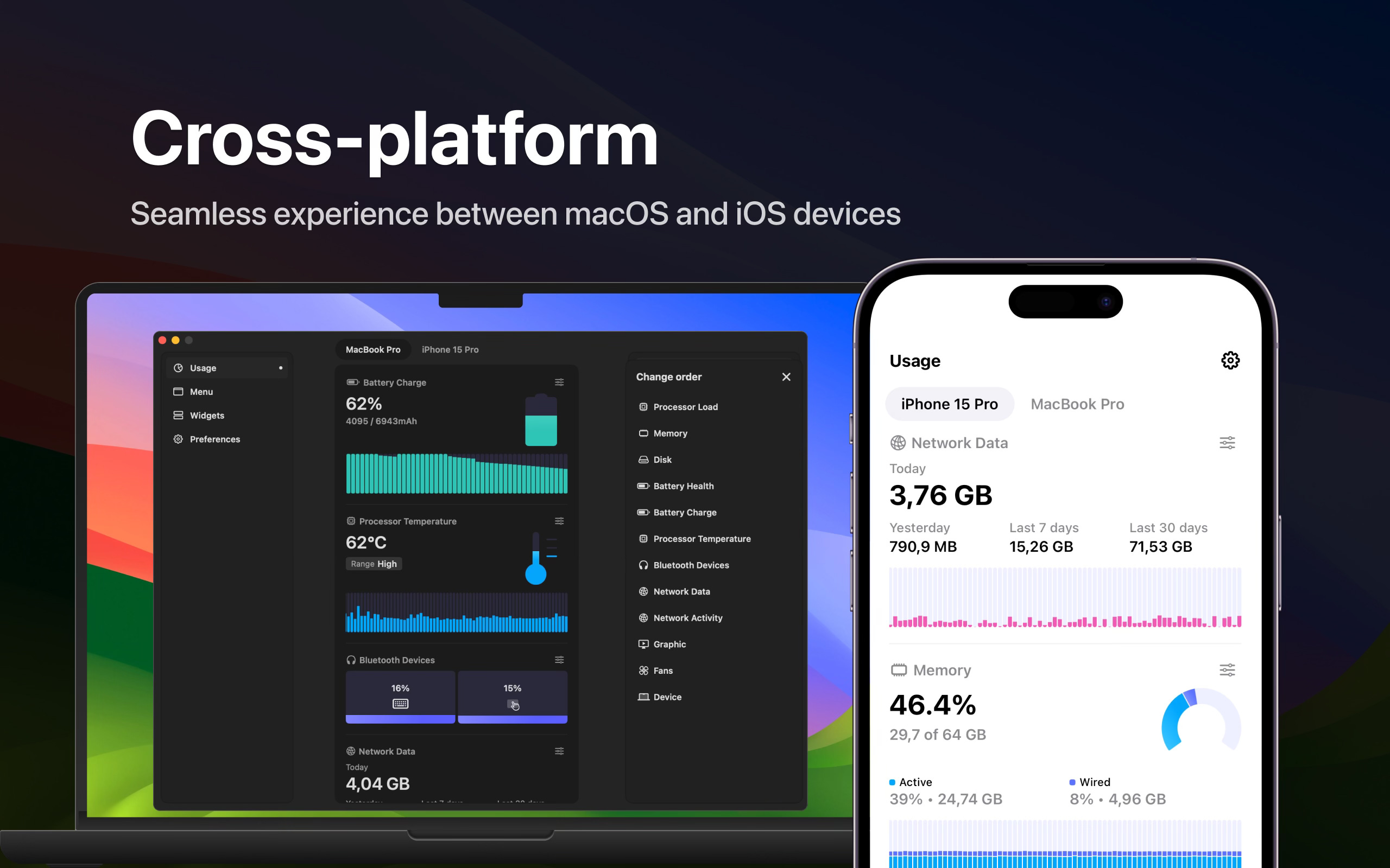
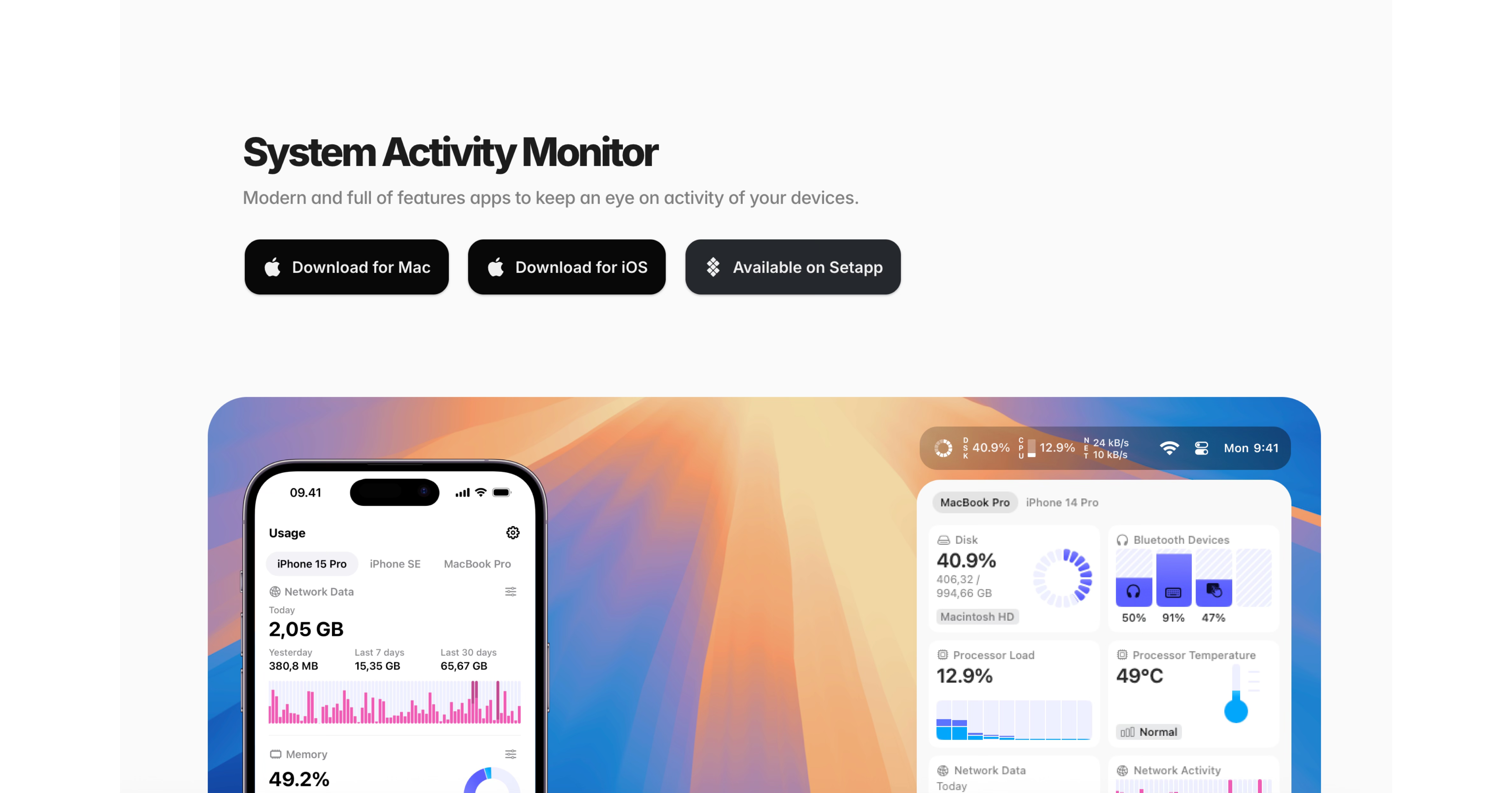
Oleh Stasula is the founder of WinWinKit, a marketing platform built for iOS, Android, and desktop apps, and Usage, a system activity monitor that helps you keep an eye on your device activity.
Today, he is sharing a few personal tips on how he designs apps users love.
This is part 1. Part 2 will be live in a couple of weeks!
Let’s dive in!
Check WinWinKit and Usage. Follow Oleh on X/Twitter and LinkedIn!

Forget about Ruby and Fastlane installation issues!
Discover Codemagic CLI tools — the free, open-source Fastlane alternative for automating iOS builds, code signing and publishing.
Designing Beautiful Apps as a Developer - Part 1
Most devs probably agree by now that coding is pretty much solved. That doesn’t mean we should stop building — quite the opposite, in my opinion. Because everyone can build and build quickly, the next question becomes outstanding design and creative marketing. That’s where products start standing out from each other.
One of the most common pieces of feedback I get on Usage is about its clean, modern design. It often gets shared not only because it’s a handy tool, but also because it looks great. I’m pretty sure I wouldn’t have hit 1.6 million installs without caring about design so much.
In this article, I’ll share a few personal tips on how I design apps users love.
Treat It as a System
We developers, are good at building systems. We’re comfortable with multi-layer communication, data structures, and patterns. To me, design is similar in many ways.
A spacing scale is a constant. A color hex is a variable. A reusable card is a view. The thinking is the same — you’re just building a visual system instead of a functional one.
I got better at design only because I stuck with the part I already liked: working with systems. The creative bits sit on top, but the system is what keeps everything from falling apart as the app grows.
Just like in development, there are patterns in design. Learn them, then combine them in your own way.
Look for Inspiration
I learn from other apps, and I try to look only at the best.
I use Mobbin for inspiration and for organizing what I find. When I’m stuck on a screen, I open Mobbin and see how apps I respect handled the same problem — onboarding, empty states, settings, paywalls. I save what’s useful, sorted by problem rather than by app. Over time, it becomes a personal reference library.
Every year, I also go through the Apple Design Awards — winners and finalists. I download them, use them for real, and pay attention to what makes them feel different. It’s rarely one big thing. It’s many small ones.
And my photo gallery is full of screenshots from other apps. Instead of scrolling through TikTok in the evening, scrolling through past screenshots is honestly more useful.
Start Simple and Don't Overcomplicate It
I’ll never beat a professional designer with a real sense of taste. I appreciate outstanding craftsmanship — the kind that looks detailed, thought-through, and creative all at once. That’s not where I’m going to land, and that’s fine.
The truth is, I don’t have to be an outstanding designer. I just have to push for the best outcome I can, while knowing my limits and not pushing past them. A simple app done well beats an ambitious one done badly. Some of the apps I admire most are restrained on purpose — less to design means less to get wrong.
Over time, I’ve learned there are things I just won’t do — sophisticated gradients, shadows and effects, over-detailed decorations, illustrations, custom icons. Even without those, the design can still feel solid and on point when it’s done thoughtfully.
Iterate a Lot
Making something users love starts with loving it yourself. And the only way to get there is by going through many iterations.
The first version of a screen is rarely the answer. I learned that from coding, and it’s even more true for design. I’ll finish a screen, convinced it’s done. The next morning, I open the app and see three things wrong with it. None of that was visible the night before. It just needed time.
This is also where AI is incredibly useful. When I’m stuck between two layouts, or unsure about a color, or torn over an icon, I can generate variations quickly and compare them side by side. The taste is still mine, but the iteration loop is much shorter than it used to be.
The rule I try to follow: don’t ship the first version that works. Sit with it. Open it the next morning or better, a few days later. Show it to a few people. Iterate again. The difference between a good app and a great one is usually just a few more rounds.
Don’t Do It All Yourself
While I do the entire design for my apps — the UI, the App Store screenshots, the website, there is one exception - the app icon. I’ve never shipped one I designed on my own.
Designing a great app icon is its own discipline. The best ones require a craft I just don’t have. So I always hand that part off — and the result is always better than what I would have come up with. Check out this iOS Icon gallery for inspiration and references. Also, a few of my favorite app icon designers:
Dominik Kandravy (app icons for my Data Plan and Voice Alarm apps)
Yannick Lung (app icon for Usage)
For you, it might also be something else.
For example, there is a rise in App Store screenshot designers, and the work they do is truly amazing. I have not used their services, but just yet.
Here are the ones I like and follow:
Develop Taste, Not Just Hard Skills
In design, taste is an important part. For many developers, it might be the most difficult part. The good news is that it can be cultivated — and when you have a sense of it, it doesn’t go away.
Train your eye on good work long enough, and your own starts catching up. That’s really the whole game.
Want to learn more? 👇
Check WinWinKit and Usage. Follow Oleh on X/Twitter and LinkedIn!