
Indie App Devs #9
Weekly tips for indie app developers.
Hello! 👋
Teodora, owner of Designerants and App Growth Academy, is back with another piece.
In the 1st issue, she shared screenshot hacks that developers can use to get users to stop scrolling. Click HERE to read it.
Topic today is how to create powerful icon designs that convert better and how to plan your icon strategy.
4 Ways to Create Professional Looking App Icons in Minutes Without Being Graphically Inclined
Today we are focusing on app icons.
After reading this, you will understand why investing time into your icons is not optional, how your competitors influence your icon strategy and four techniques to create more impactful icon designs that convert.
App icons are the first impression of your product in the App Store.
Before a user even reads your app title, they decide whether your app feels trustworthy and relevant based solely on that tiny square. If the icon fails, they move on.
If it looks unclear or unprofessional, they will likely ignore your app again later without giving it a second thought.
Study the competition
Before starting with your own app icon, you need to check your competitors’ icons.
This is something a small percentage of app owners do and will help your app stand out.
You are not building your product in an isolated fashion, you are competing for users daily.
If you build with other products in mind, you have a higher chance of winning the ladder competition.
This is easy to execute, here’re a few examples:
Are all your competitors’ icons blue? Make a red one instead.
Do all your competitors have abstract brand logos? Use text instead.
The goal is to stand out. No matter what your idea is, an icon that is not lost in a sea of apps will always outperform.
Ask yourself:
Do they all use the same color palette?
Are they leaning on brand logos?
Which icons visually pop from the list?
Your job is to break the pattern.
If the entire category is blue, try bold orange or red. If everyone uses abstract shapes, test a text-based approach instead. Contrast is what gets a user to stop scrolling.
Why CEOs need to know about this too
Even if you’re not a designer, any entrepreneur aiming to build a successful app business should learn the basics of creating effective icons.
Why?
Because you may not create the icons, but your feedback matters the most.
Not only because it’s your app, but because you should be the one who understands the relationship between your product and your app the best.
The faster you are, the faster your team will be.
Icons are the first impression of your app.
Most users decide whether to download an app based solely on the icon! If it looks like a scam or doesn’t match the app name and screenshots, they will ignore it.
The worst part is, if they see your icon again, they will probably make an emotional decision and skip it as well, thinking:
“It didn’t feel right.”
Users may not understand the reasoning behind their choices, but their brain is making decisions based on memory every second.
Pick colors like a pro
Before starting with the 4 ways of creating professional-looking app icons, you first need to choose a good color.
You must avoid the mental block that often appears when designing a new icon.
You could spend hours trying to decide. Do not overthink color choices.
Instead, do this:
Go directly to libraries made by professionals.
Choose one main color and one secondary color, no more.
To pick a secondary color that pairs well with the main one, take your main color’s hex code and ask an AI like Grok to provide its complementary color. That becomes your secondary color.
I recommend using Tailwind Colors and Apple Colors.
The most important rule here: do NOT pick the same colors as your competitors.
If the apps in your category are mostly green, choose a complementary color like orange instead.
Simplicity is king
Do not add dozens of small elements inside the app icon.
Keep it simple, with just one or a maximum of two elements.
If you add too much noise inside the app icon, users will not be able to recognize any of the elements and they will simply skip downloading the app.
App icons are very small in the App Store.
If you cannot identify what your icon represents at the size it appears in the app stores from a short distance away, you need to zoom in, adjust the colors, or remove elements until it is easily recognizable.
4 ways to create a professional looking app icons
#1: Using Midjourney
Using Midjourney or any other AI for image generators is a competitive advantage.
We are now in the AI era.
Will allow you to launch your app without having to overthink.
If your app is a Bitcoin wallet, you can use a prompt such as:
”Wallet app icon with Bitcoin logo”
Result:

Think about what your app does and use it as a prompt accompanied by keywords like “app icon” or the style you want like “3D” or “modern minimalist”.
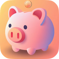
If your app, for example, is a budget planner, you can simply use a prompt like:
“App icon for a budget planner app with a piggy bank and a background with orange colors in a modern minimalist style”
Result:
More Midjourney prompts examples:
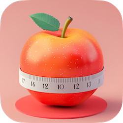
“App Store icon for a calories tracking app, 3d”
Result:
“Flat 2d minimalistic icon with charts with one big arrow, orange and yellow”
Result:

#2: Using predefined icons
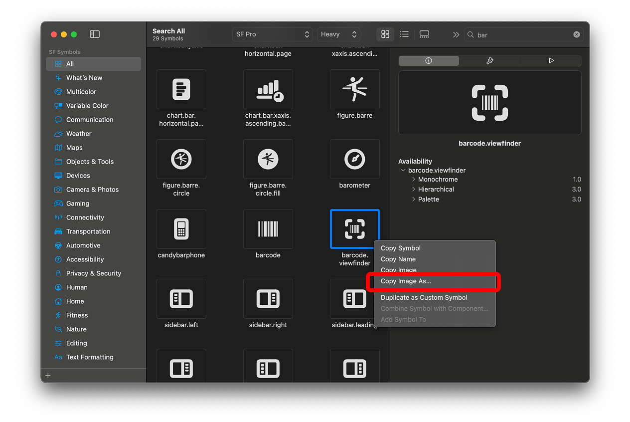
Go to Apple’s SF Symbols library and pick an icon that represents what your app solves.
Users are so familiar with Apple icons that they won’t need to spend any mental effort to interpret the icon or understand what the app does.
Familiarity is often undervalued.
The more familiar something is, the less explanation a user needs to understand what the app is about.
Trying to create flashy custom icons or brand logos is not very beneficial, as people will probably not recognize them unless you have a marketing budget of several thousand dollars.
You just need to download the icon from the SF Symbols library and import it into any design software you use, such as Figma, Sketch, Photoshop, Illustrator…
💡 Extra tip: You can export the icon in .SVG format. If you import it into Figma, you will be able to change its color.
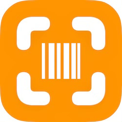
Then, pick a background color inside the design software following the rules explained in the section above.
Result:
#3: Using text
If you don’t have a great icon idea and you are in a rush to launch your app, you can use text as an effective placeholder to launch it quickly without delays and after A/B test other icons.
The trick here is to use the capital letters from your app name. Yes, this is allowed within the App Store Guidelines.
Imagine your app’s name is “Design Notes.”
Result:
Here are more examples for inspiration:
#4: Use the caricature technique
A developer taught me this way of creating app icons that works like a charm.
He calls it the “caricature technique.”
This method is about exaggerating and capturing the app’s functionality using just a few elements.
You need to think about how you can represent what your app does in its purest form, using elements everyone already understands.
Think of memes. They say so much with so little. That is exactly the point of creating app icons with this technique.
A good caricature simplifies complexity into something anyone can grasp at a glance. Your app icon should be clean and free of unnecessary details.
This means bold lines, clear shapes and high contrast colors.
Plus, the caricature technique allows you to A/B test continuously because the style is timeless.
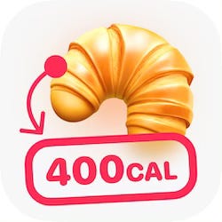
Let’s look at this client example. A calorie tracker app whose main paying users want to lose weight but still enjoy guilty pleasures.
After some research, I discovered that croissants are one of the most common guilty pleasures among people following a strict diet.
The icon result? A big croissant generated using the Midjourney prompts I shared above, with a bold arrow pointing to a red label displaying the calories.
Clear, precise, stands out because of the red touch and explains what the app does in less than a second.
Result:
More examples.
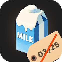
This client’s app helps users keep track of their food expiration dates. I did some research and found that many people were struggling to avoid letting their dairy expire, especially milk.
The result? A big milk bottle with a clear tag resembling expiration. Recognizable and relatable at first sight for users browsing the App Store.
Result:
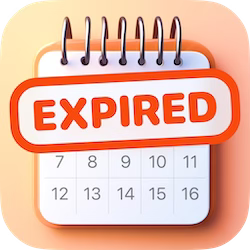
Here is another icon we A/B tested. It features a calendar with a bold label highlighting the main problem the app solves.
Result:
💡 Bonus trick: You can also use memes people already known as an app icon. Just be sure they are not registered as intellectual property or trademarks, so you avoid getting rejected when submitting your app to review inside the App Store.
Want to learn more?
Teodora shares all her App Growth secrets 👉 App Growth Academy.
Don’t forget to check Designerants where she creates screenshots that convert to downloads and revenue in the App Store.
And follow her on X & LinkedIn.